Ebola open data analysis completed
Over the last few weeks I surveyed every bit of available data on the 2014 Ebola Outbreak in West Africa that I could find. There were two major sub-tasks to the survey: broad-search and then dig-into-the-good-stuff.
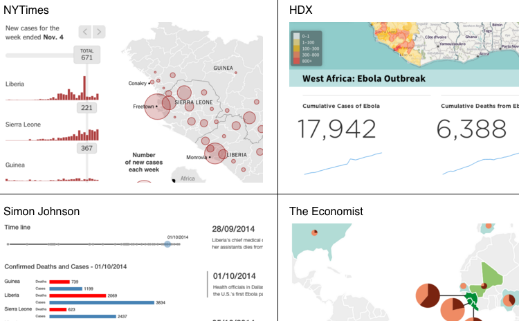
For the first sub-task, the work started with cataloging the datasets on eboladata.org. I sifted through those 36 (and growing) datasets. My analysis of those can be found on the EbolaMapper wiki at Datasets Listed on eboladata.org. An additional part of this first sub-task was to catalog the datasets available at HDX and NetHope.
I have posted the conclusions of sub-task #1 on the wiki at Recommendations for Data to Use in Web Apps. The humanitarian community seems most comfortable with CSV and Excel spreadsheets. Coming from a web services background I expected a JSON or XML based format, but the humanitarians are not really thinking about web services, although the folks at HDX started on an effort which shows promise. Finally, for data interchange, the best effort within the CVS/spreadsheet space is #HXL.
The second major sub-task centered on hunting down any “hidden” JSON: finding the best visualizations on the web and dissecting them with various web dev-tools in order to ferret out the JSON. That which was found could be considered “private” APIs; it seems that there has not yet been any attempt to come up with a API (JSON and/or XML) for infectious disease records. At best, folks just pass around non-standard but relatively simple CSVs and then manually work out the ETL hassles. My analysis of the web service-y bits can be found on EbolaMapper wiki as well at JSON Ebola2014 Data Found on the Web.
My conclusion from the second sub-task is that the world needs a standard data format for outbreak time series, one which is friendly to both the humanitarian community and to web apps, especially for working with mapping software (read: Leaflet). Someone should do something about that.