Rosling on which stats matter
Hans Rosling was recently interviewed on the BBC’s More or Less. He was doing he regular excellent job of entertainingly engaging the public via statistics. The full interview is less than ten minutes. The BBC also did a write up of the interview.

Rosling reported that in Liberia at the peak of the outbreak daily infections were about 75 per day and are now stuck at around 25 per day. He believes the current (second) stage of the outbreak could well be labeled as endemic , an intermediate level epidemic that will take some time to put out.
A statistic that he says is important is the reproductive number. At the peak of the outbreak it was almost 2.0; currently it is closer to 1.0. The point is that the reproductive number is a key stat that needs to be tracked.
Later, five minutes into the interview, he has a go at main stream media’s reportage, specifically the use of cumulative numbers:
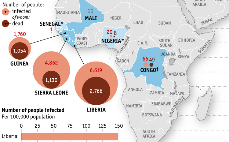
It is a bad habit of media. Media just wants as many zeros as possible, you know. So, they would prefer them to tell that in Liberia we have had about 2,700 cases or 3,000 case. The important thing is that it was 28 yesterday. We have to follow cases per day. I can take Lofa province, for instance, that has had 365 cases cumulative and the last week it was zero, zero, zero, zero every day. That is really hopeful that we can see the first infected [county] is where we now have very low numbers because everyone is aware.
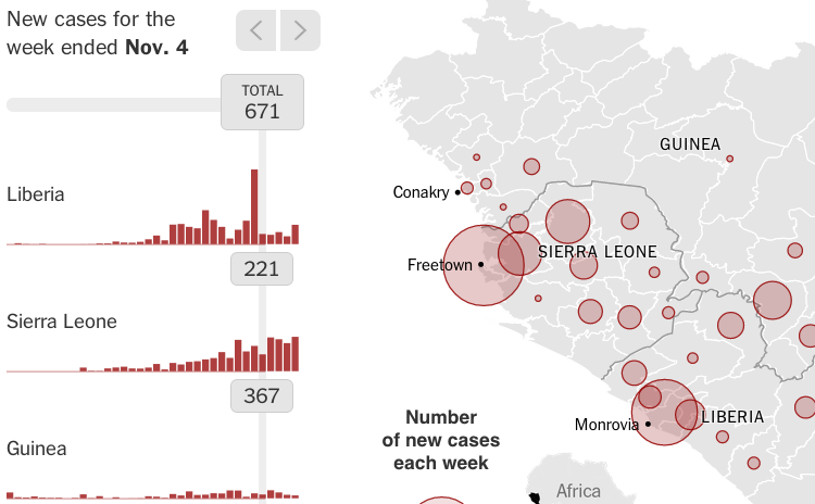
Notice that the NYTimes ebola viz uses cases-per-week. We can build out visualization tools which provide a similar level headed overview of a situation, which might even help to reduce anxiety in the public compared to cumulative-cases representations.
Take away: the two statistics he pointed out, cases-per-day and reproductive-number, will be visualized in this open source epidemic monitoring dashboard tool set being built out here.
NYTimes: the pace car
The New York Times’ ebola visualization sets the bar for high quality interactivity.
That makes sense as Mike Bostock works at the Times. He is one the creators of D3.js which is the open source engine behind most of the gorgeous data-driven visualizations on the Web these days. If you have not yet seen it, the D3.js examples gallery is a whole lot of eye candy.
Take this outbreak visualization as confirmation that any open-source white label outbreak widget should be based on D3.js.
Tweets about deadly diseases
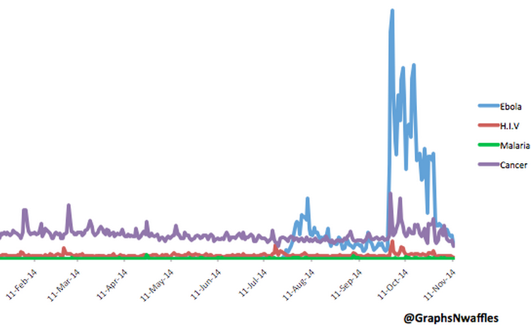
Graphs ‘N’ Waffles is a twitter feed that delivers just what the name implies. This recently tweeted graph is worth a gander. That is quite an uptick the blue line took.
Another ebola factoid was reported by The Lancet:
During October, there were 21,037,331 tweets about Ebola in the USA, compared with 13,480 about Ebola in Guinea, Liberia, and Sierra Leone combined.
Three interactive ebola visualizations
Visualizations on the Web can be classified as interactive or static. The split is not quite binary; is a zoomable map really “interactive”?
I want to produce both interactive and static viz, with hopefully the former being used to generate the latter. SVG is good for exporting static raster images to file or paper. D3.js uses SVG, so interactive D3.js-based visualizations should be able to export excellent static maps and charts (we will see). Some users of this information will be on limited machines so bandwidth-light static info should be readily available.
I have found very few highly interactive ebola visualizations. Please point out any that I have missed in the comments. The best three found so far are listed here.
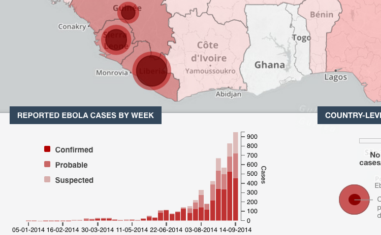
PBS Frontline’s map: how the ebola outbreak spread through Africa
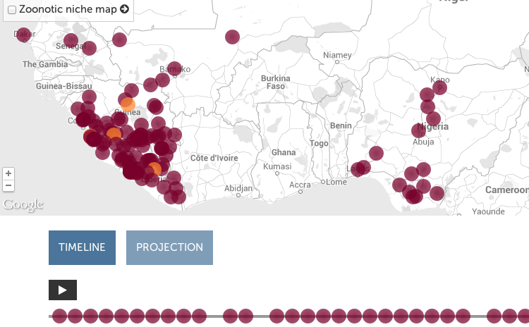
All three’s features, pros, and cons are analyzed on the EbolaMapper wiki.
Gallery of ebola visualizations
A major goal of this EbolaMapper project is to create the very best visualizations of ebola on the Web. Which leads to the question: what is the high bar? [Update: Spoiler, the answer is The New York Times’ visualization.]
To answer that question I will be curating a collection of links to the best visualizations found on the Web.
For example, The Economist is doing good work:
The curated links can be found on the EbolaMapper wiki.
Note: EbolaMapper is the working title for this project; really it is more like “Reusable Outbreak Monitoring Web Components for a Global Outbreak Monitoring Network Organization.” Right, so EbolaMapper is the working title until a better name comes along, if one did not just pass by a moment ago…
First success indicator: a working EbolaMapper
The thing that got me moving on this (ebola) outbreak project was the WHO’s Ebola Portal, specifically the rather well implemented Web visualization of the 2014 ebola outbreak.
That sort of thing is exactly what the world needs. As for technical implementation details, they made the right choice basing it on interactive JavaScript libraries rather than Flash. They planned to make the data available:
“Data will be made available for open access in the coming days. All data will be made available via open format downloads as well as through an open access API.”
Sadly the visualization’s development and, more importantly, its data seems to have stalled. The data was last updated on September 14, 2014 (almost three months old as I type this). The code is on github with the last commit on September 27th.
[Update: By mid-December 2014 the main site, extranet.who.int/ebola/, had been taken down; I guess they did not realize that the visualization lives on at GitHub.]
I cannot find anything more about the planned open access APIs. Unfortunately I could not find any licensing information in the repository. I want to move their vision forward but using open source and open data. Or let us think big: why do we even need to wait around for the WHO to come down from on high with the numbers? Surely there is a better way…
These guys obviously did good work. I will try to get in contact with them. I will report back in an future post.
Nonetheless, this thing (“ebola-data” is its name on github) is what inspired me. If only it were clearly licensed and the data was fresh (and licensed openly). If such a thing were widget-ized and made freely available the Web would have a many more eyeballs taking in quality visualizations of the crisis.
I am calling such a thing EbolaMapper. (The name is a bit misleading; the code is reusable in that there is nothing ebola specific about it but “Outbreak Visualization Widgets” is not a catchy at this time, even though that is what this is all about. I will get around to explaining all that in the long run.)
So, I started digging around and found out about the Ebola Open Data Jam that took place on October 18th. Well, that there is the open data problem getting worked on.
Next I found the Africa Open Data meetup. On the conference call of November 7th it became clear that data validation was the current step, blocking quality visualizations. What better way to validate the data than to run it through a visualization on a world map?
So, I’ve started a repository on github for EbolaMapper which will be a clean room re-implementation of the WHO’s ebola-data viz with a clear open source license (Apache 2.0). I will use some data found by the Ebola Open Data Jam. What is really needed is a standard for data interchange – APIs and such.
When EbolaMapper can do what the WHO ebola-data visualization does, and more, via data from a standard API, that will be the first major milestone in this project.
Tao of open source applied to outbreaks
The real heroes in the ebola response story are the medical folks on the front line (damn, if MSF is not just a bunch of straight talk bad asses). Yet as this sad story has developed I can see a need for help from the software community in terms of tech talent in order to bring the latest Web tech to bear in the global ebola response. And let us think big: not just this rather small, tragic outbreak but what about the global infrastructure for all future outbreaks? Is that really going to be WHO gather data and slowly publishing via HTML and PDFs?
This thought has been bothering me for a while and now I’ve decided to try and help as I see a clear path forward on a specific tech issue: getting the numbers and dates out (lots more to come on this).
As the press has asked, Why Isn’t Silicon Valley Doing More to Fight Ebola? And, well, there have been some private financial donations big and small, the biggest being:
| $ | Source |
|---|---|
| $126MM | Allen |
| $50MM | Gates |
| $25MM | Zuckerberg |
| $15MM | Page |
Making it rain is great and good on them. That money will go through the old and some new channels to buy “materials and services and provide swift action where it is needed”. What I see though is a need for better software (“have hammer, see nails” I guess) and new channels – Internet channels.
So, let’s see if the tao of open source can be brought to bear on this problem (a ludicrously outdated global outbreak monitoring infrastructure) and if some tech talent can be rallied to the cause.
val blogging = true
I have something I want to express; time to blog up. So, tooling: what to use these days?
- I am completely addicted to org-mode. The syntax org uses is kind of a markdown variant. It has become my native written English “dialect.” So, blogging in org syntax is a major goal. Org has excellent export capabilities. Perhaps exporting will not even come into play but it is a nice fallback to have in store.
- When architecting, I love to use static content as much as possible so a static site generator seems like the right type of machinery to choose for blogging.
- I’m all about that open source so GitHub is in the picture. GitHub uses Jekyll to host static pages.
So, Plan A is: org to Octopress to Jekyll, with Octostrap to make it pretty via Bootstratp. Here, Bootstrap is dailed in to look a lot like GitHub. So, that is Octopress looking like Github via Bootstrap. Let’s call it… octopussy in deference to Oxley’s original intent, more on that later.