Gallery of ebola visualizations
November 11, 2014
A major goal of this EbolaMapper project is to create the very best visualizations of ebola on the Web. Which leads to the question: what is the high bar? [Update: Spoiler, the answer is The New York Times’ visualization.]
To answer that question I will be curating a collection of links to the best visualizations found on the Web.
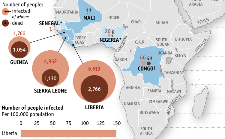
For example, The Economist is doing good work:
The curated links can be found on the EbolaMapper wiki.
Note: EbolaMapper is the working title for this project; really it is more like “Reusable Outbreak Monitoring Web Components for a Global Outbreak Monitoring Network Organization.” Right, so EbolaMapper is the working title until a better name comes along, if one did not just pass by a moment ago…
